Bootstrap Alert Example
Intro
The alerts are created by these components you even do not think of until you truly get to need them. They are put to use for giving fast in time comment for the user interacting with the site hopefully directing his or hers attention to a specific direction or evoking certain actions.
The alerts are most commonly used together with forms to give the user a tip if a field has been filled in wrongly, which is the correct format expected or which is the status of the submission once the submit button has been clicked.
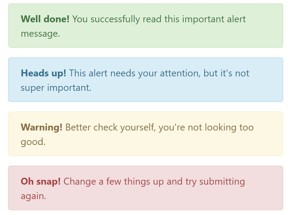
As the majority of the elements in the Bootstrap framework the alerts also do have a well-kept predefined presentation and semantic classes that can possibly be used according the particular circumstance in which the Bootstrap Alert has been shown on display. Due to the fact that it's an alert message it's important to grab user's care but still leave him in the zone of comfort nevertheless it might even be an error notification. ( learn more)
This gets fulfilled due to the use of mild toned color options each being intuitively connected to the semantic of the message material like green for Success, Light Blue for general details, Pale yellow desiring for user's interest and Mild red specifying there is actually something wrong.
<div class="alert alert-success" role="alert">
  <strong>Well done!</strong> You successfully read this important alert message.
</div>
<div class="alert alert-info" role="alert">
  <strong>Heads up!</strong> This alert needs your attention, but it's not super important.
</div>
<div class="alert alert-warning" role="alert">
  <strong>Warning!</strong> Better check yourself, you're not looking too good.
</div>
<div class="alert alert-danger" role="alert">
  <strong>Oh snap!</strong> Change a few things up and try submitting again.
</div>
Color tone of the link
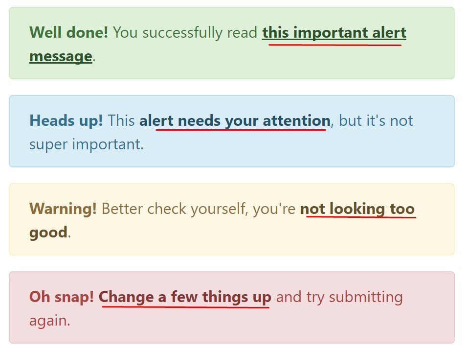
This might not be noticed at a look but the font colour also is in fact following this colour scheme as well-- just the color options are much much darker so get subconsciously seen as dark nevertheless it's not exactly so.
Same runs not only for the alert text message itself but also for the links incorporated in it-- there are link classes taking off the outline and coloring the anchor elements in the appropriate color so they fit the overall alert message look.
<div class="alert alert-success" role="alert">
  <strong>Well done!</strong> You successfully read <a href="#" class="alert-link">this important alert message</a>.
</div>
<div class="alert alert-info" role="alert">
  <strong>Heads up!</strong> This <a href="#" class="alert-link">alert needs your attention</a>, but it's not super important.
</div>
<div class="alert alert-warning" role="alert">
  <strong>Warning!</strong> Better check yourself, you're <a href="#" class="alert-link">not looking too good</a>.
</div>
<div class="alert alert-danger" role="alert">
  <strong>Oh snap!</strong> <a href="#" class="alert-link">Change a few things up</a> and try submitting again.
</div>
Other information for alerts
A thing to mention-- the color tones take their obvious meaning just for those who in fact get to see them. It's a good thing to either make sure the visible text itself carries the meaning of the alert well enough or to eventually add some additional descriptions to only be seen by the screen readers in order to grant the page's accessibility.
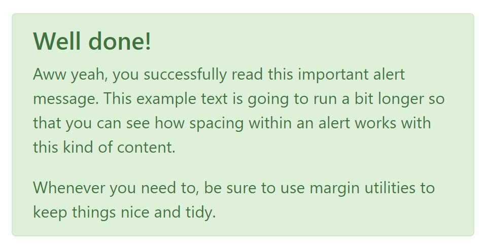
Besides links and basic HTML tags like strong for example the alert elements in Bootstrap 4 can also have Headings and paragraphs for the cases when you want to present a bit longer content ( get more info).
<div class="alert alert-success" role="alert">
  <h4 class="alert-heading">Well done!</h4>
  <p>Aww yeah, you successfully read this important alert message. This example text is going to run a bit longer so that you can see how spacing within an alert works with this kind of content.</p>
  <p class="mb-0">Whenever you need to, be sure to use margin utilities to keep things nice and tidy.</p>
</div>
Reject the alert
You can as well provide an X icon to dismiss the alert and incorporate a cool transition to it to one more time ensure the visual pleasure of the Bootstrap Alert Popup visitors.

<div class="alert alert-warning alert-dismissible fade show" role="alert">
  <button type="button" class="close" data-dismiss="alert" aria-label="Close">
    <span aria-hidden="true">×</span>
  </button>
  <strong>Holy guacamole!</strong> You should check in on some of those fields below.
</div>
Currently there are four kinds of contextual alert messages in Bootstrap 4 framework - they are knowned as Success, Info, Warning and Danger. Do not allow however their names to limit the manner you are actually using them-- these are simply a number of color schemes and the way they will be really performed in your website is definitely up to you and fully depends on the certain situation.
For example-- if the color scheme of your page utilizes the red as primary colour it maybe pretty appropriate to present the alert for successful form submission in red as well working with the predefined alert danger look in order to better blend with the web page and save time specifying your own classes.
Anyway the predefined alert classes are simply some consistent looks and the responsibility for working with them lays entirely on the designer's shoulders.
JavaScript behaviour of the Bootstrap Alert Warning
Triggers
Enable dismissal of an alert through JavaScript
$(".alert").alert()Enable dismissal of an alert through JavaScript
Or even with information features on a button in the alert, as displayed above
<button type="button" class="close" data-dismiss="alert" aria-label="Close">
  <span aria-hidden="true">×</span>
</button>
Notice that shutting off an alert will take it out from the DOM.
Solutions
$().alert()$().alert('close')Events
Bootstrap's alert plugin exposes a few events for fastening right into alert functions.
close.bs.alertclosed.bs.alertTake a look at several on-line video guide about Bootstrap alerts
Linked topics:
Bootstrap alerts formal records
W3schools:Bootstrap alert tutorial

Bootstrap Alert Issue
